Mall Customer Segmentation

You own the mall and want to understand the customers like who can be easily converge (Target Customers) so that the sense can be given to marketing team and plan the strategy accordingly. By the end of this case study , you would be able to answer below questions.
Data Understanding
Import Package and Data
Started with imports of some basic libraries that are needed throughout the case. This includes Pandas and Numpy for data handling and processing as well as Matplotlib and Seaborn for visualization.
import pandas as pd
import numpy as np
import matplotlib
import matplotlib.pyplot as plt
import plotly.express as px
import seaborn as sns
import sys
import warnings

if not sys.warnoptions:
    warnings.simplefilter("ignore")
For this exercise, the data set (.csv format) is downloaded to a local folder, read into the Jupyter notebook and stored in a Pandas DataFrame.
df = pd.read_csv('C:\My Files\Document\Coding\Datasheet\Mall_Customers.csv')
df.head()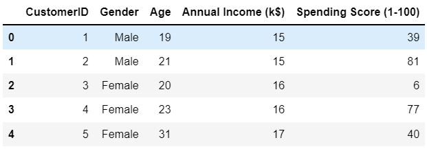
Exploratory Data Analysis
I see an ID column here, I'll drop it right away because the ID is just a unique number that identifies each row, not a feature therefore ID column is meaningless in this analysis.
df.drop('CustomerID', axis=1, inplace = True)
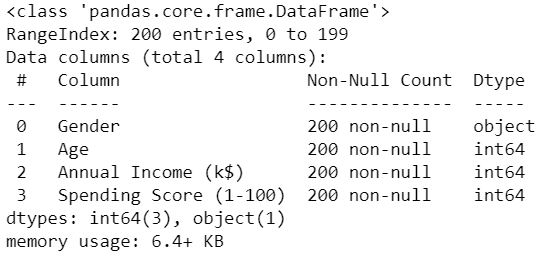
df.head()The first part of EDA the data frame is evaluated for structure, columns included and data types to get a general understanding for the data set. Get a summary on the data frame include data types, shape, and memory storage.
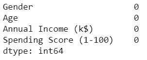
Lets check the missing value from the predictor, and there are no missing values and all the predictor variables are numerical.
Get statistical information on numerical features.
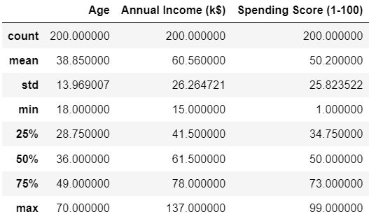
We saw multiple values of data with the .describe( ) method. What caught my attention here was the height of the standard deviations. Because in the column whose average is 50, about half of it, that is 25 standard deviations, there is also the same situation in the annual income. The Age column also has a standard deviation of about 33% compared to the mean. Lets look the correlation:
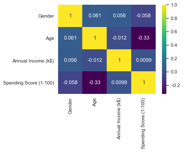
From the picture above, it can be seen that the older customers have less income and therefore spend less money. Lets find the distribution of Spending Score, Age, and Annual Income.
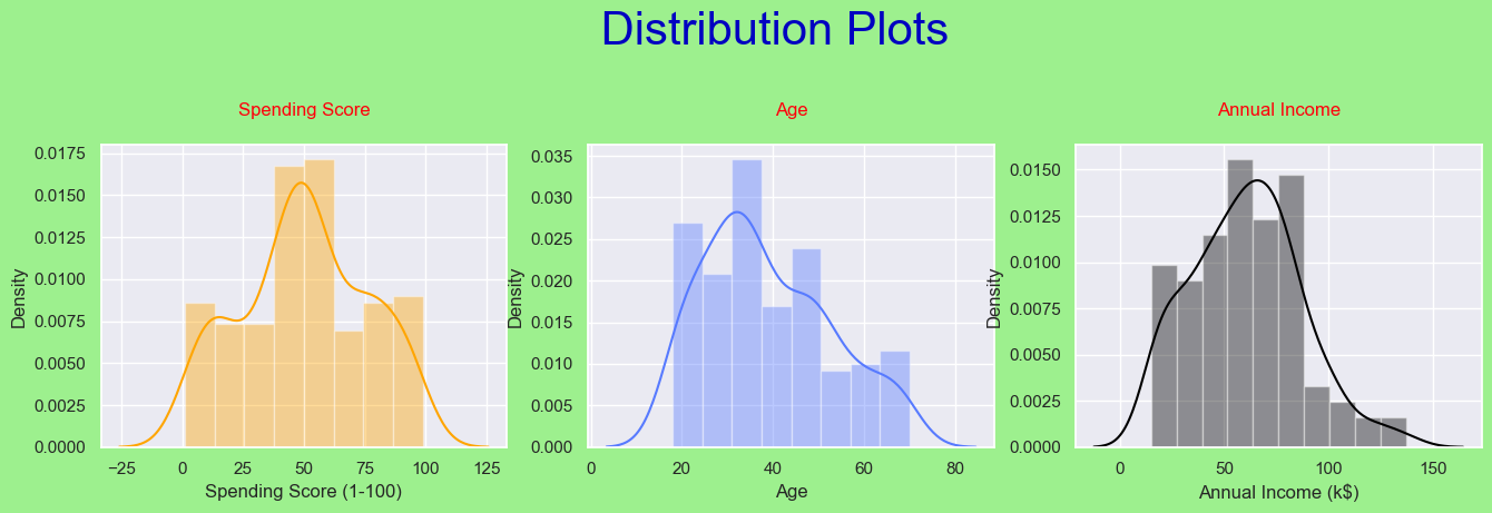
The distributions are generally similar to the normal distribution, with only a few standard deviations. The 'more normal' distribution among the distributions is the 'Spending Score'. That's good because it's our target column.
We converted the 'Gender' column to numeric using the 'Label Encoder'. Male --> 1 , Female --> 0
# Before-After Label Encoder

from sklearn.preprocessing import LabelEncoder

print('\033[0;32m' + 'Before Label Encoder\n' + '\033[0m' + '\033[0;32m', df['Gender'])

le = LabelEncoder()
df['Gender'] = le.fit_transform(df.iloc[:,0])

print('\033[0;31m' + '\n\nAfter Label Encoder\n' + '\033[0m' + '\033[0;31m', df['Gender'])
Lets calculate how much to shop for which gender.
spending_score_male = 0
spending_score_female = 0

for i in range(len(df)):
    if df['Gender'][i] == 1:
        spending_score_male = spending_score_male + df['Spending Score (1-100)'][i]
    if df['Gender'][i] == 0:
        spending_score_female = spending_score_female + df['Spending Score (1-100)'][i]


print('\033[1m' + '\033[93m' + f'Males Spending Score  : {spending_score_male}')
print('\033[1m' + '\033[93m' + f'Females Spending Score: {spending_score_female}')
We found that Males spending score = 4269 and Females spending score = 5771. Lets try to understand the relationship between gender and spending score.
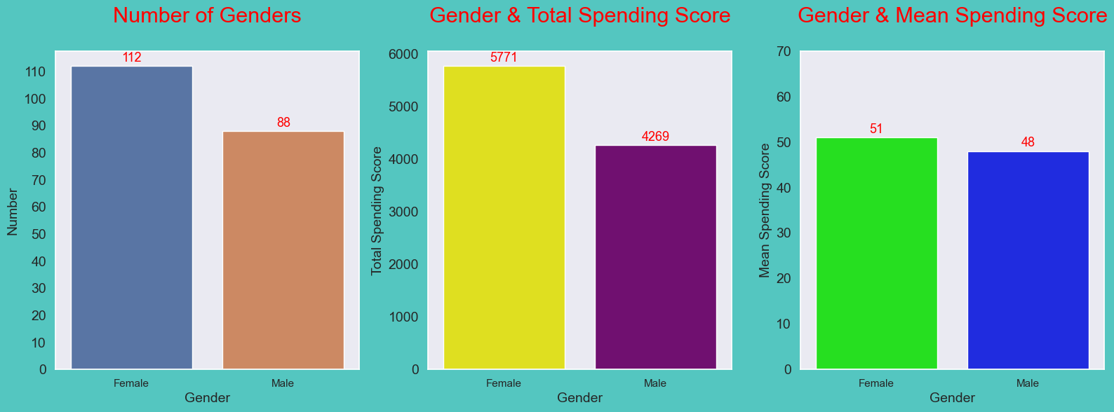
From the picture above, we can understand that There is no significant difference in the mean spending scores of males and females. Since the mean spending scores are very close to each other, the difference between the total spending scores is the difference between the number of male and female customers, but this difference is not serious. Considering all this, it would be meaningless to choose a gender-based target audience.
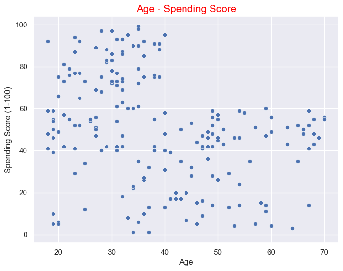
Let's look at the relationship between Age and Spending score.
Let's look at the relationship between Annual Income and Spending Score
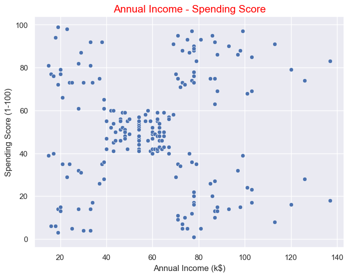
One of the two regions shown can be selected as the target audience. Even though the number of people whose annual income is between (40-60)k$ is higher (we understand this from the number of data points), the number of that audience is higher but the spending score is low, so if we make shopping attractive for them by choosing the target audience from the two regions above, we will see more profit can be made.
Clustering
Clustering (4 Variables)
Since we will be doing clustering with 4 variables, I will reduce the size, because after the clustering, I may have trouble in 3D visualization while visualizing. I will do the dimension reduction with PCA, PCA works like this: for example we have a dataset with 4 columns, we want to make it as many columns as we want, I will reduce it to 2 columns.x = df.iloc[:,0:].values
print("\033[1;31m" + f'X data before PCA:\n {x[0:5]}')
# standardization before PCA
from sklearn.preprocessing import StandardScaler
sc = StandardScaler()
X = sc.fit_transform(x)
# PCA
from sklearn.decomposition import PCA
pca = PCA(n_components = 2)
X_2D = pca.fit_transform(X)
print("\033[0;32m" + f'\nX data after PCA:\n {X_2D[0:5,:]}')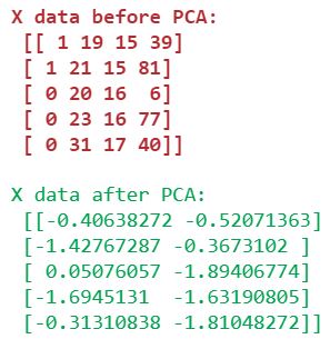
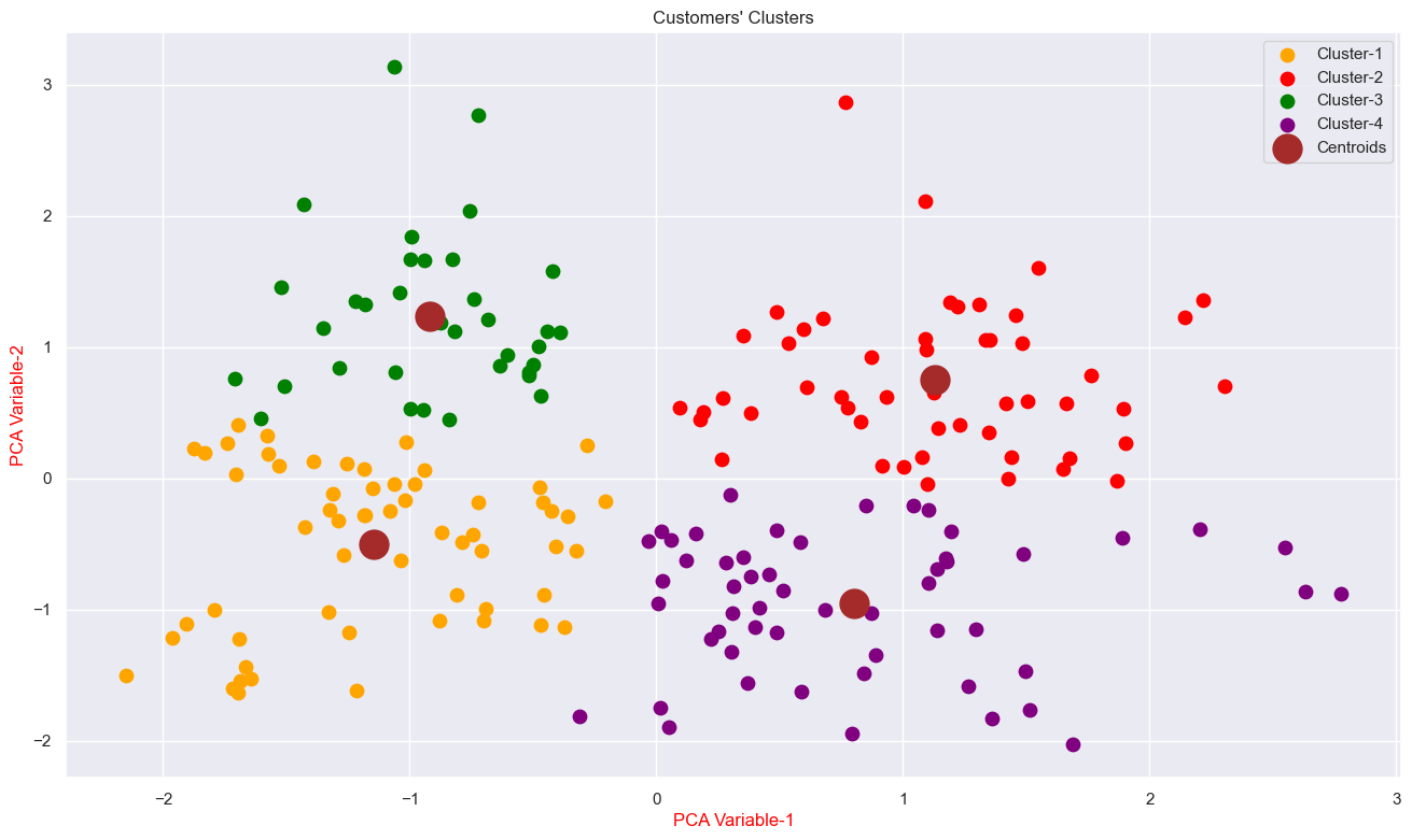
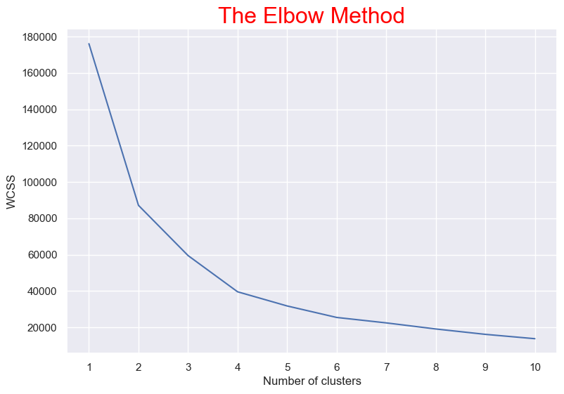
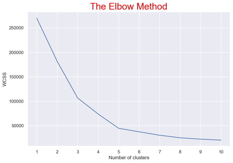
As you can see, X data, which we defined as 4 dimensional (red part), has now been reduced to 2 dimensions (green part). After that we need to find optimum number of clusters using Elbow Method.
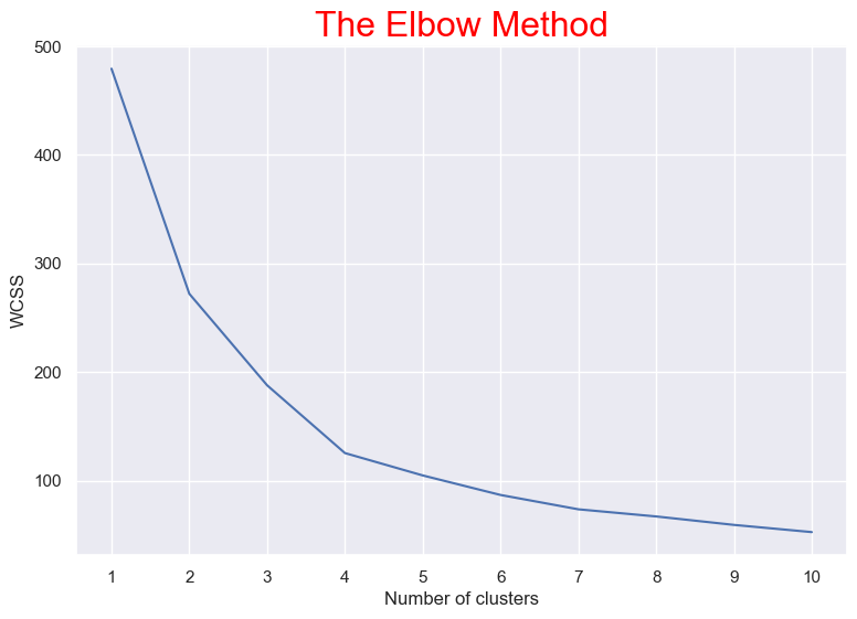
We found '4' is optimum number of clusters. Because the most break in the chart is at that point. This is how we will select the next optimal n_clusters. And we can see the cluster visualization below with the centroid.
Clustering (Age & Annual Income & Spending Score)

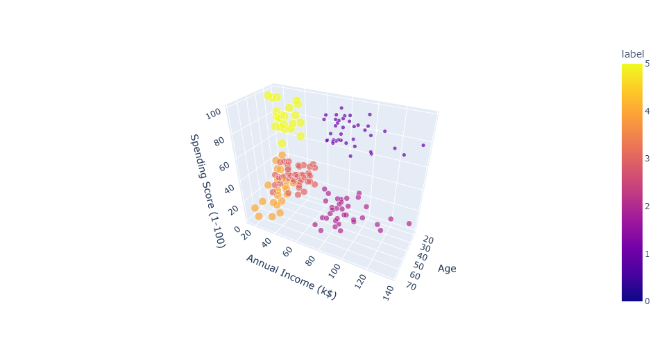
We found '6' is optimum number of clusters. Because the most break in the chart is at that point. And we can see the cluster visualization below with the centroid.
Clustering (Age & Annual Income)
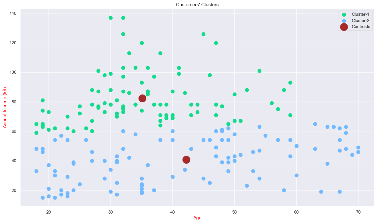
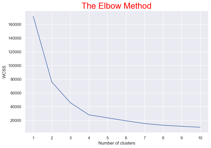
We found '2' is optimum number of clusters. Because the most break in the chart is at that point. And we can see the cluster visualization below with the centroid.
Clustering (Annual Income & Spending Score)
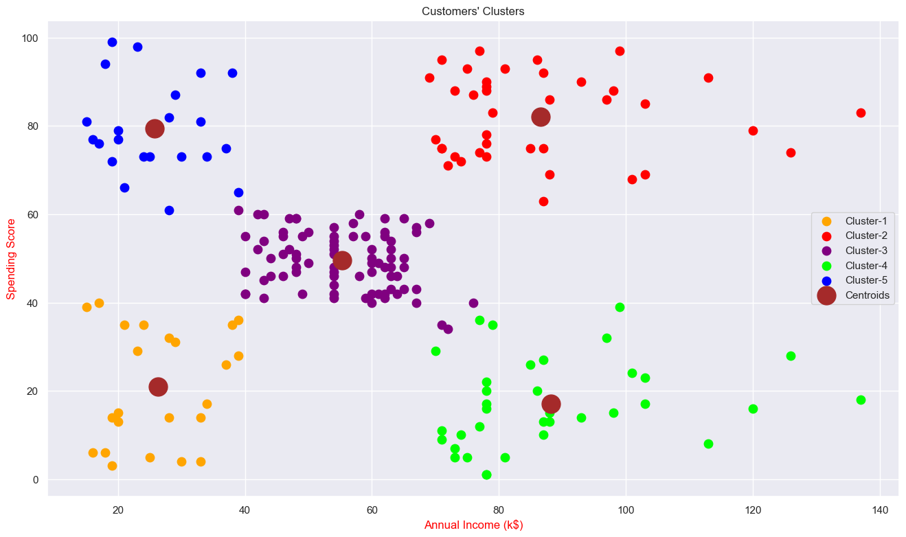
We found '5' is optimum number of clusters. Because the most break in the chart is at that point. And we can see the cluster visualization below with the centroid.
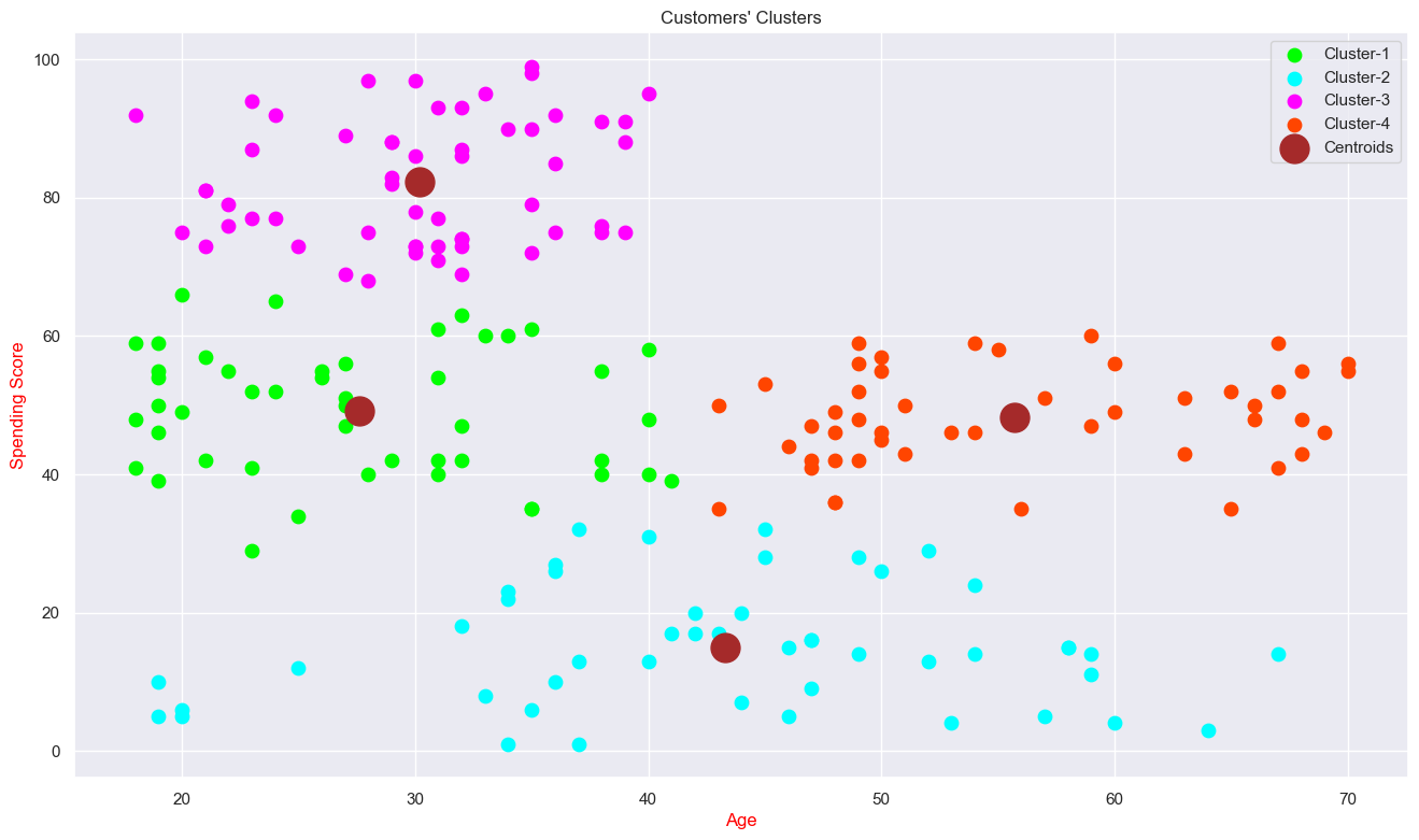
Clustering (Age & Spending Score)
We found '4' is optimum number of clusters. Because the most break in the chart is at that point. And we can see the cluster visualization below with the centroid.